A Complete Guide to CSS Transform Properties (+Examples)
Learn how to make your website come alive with CSS transform properties to make it stand out online.

You have written your HTML, and your CSS seems right. Your web page looks fantastic, but something is missing. Your website does not look alive to give that pop.
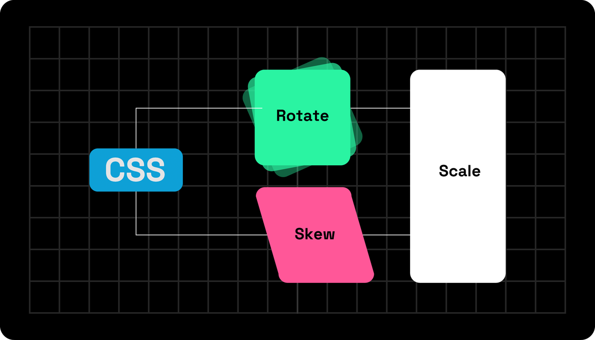
This is where CSS transform properties are powerful, making your web pages look alive. With them, you can skew, move, rotate, and resize elements to add magic for your users to enjoy.
We have found that using our CSS Transform Generator tool makes our websites dynamic and interactive. When hovering over them, images tilt, and you can change much more with it.
CSS Transform Basics
You must have a stable CSS basis before learning everything about CSS transforms. If you do not know much about CSS animation, you can learn more by reading this post. Now, what is CSS transform?
CSS transform allows you to manage an element visually by moving it around, scaling, rotating, or skewing it. These changes can occur in two-dimensional or three-dimensional space, allowing you to use your creativity.
Here is how a straightforward CSS transform looks like:
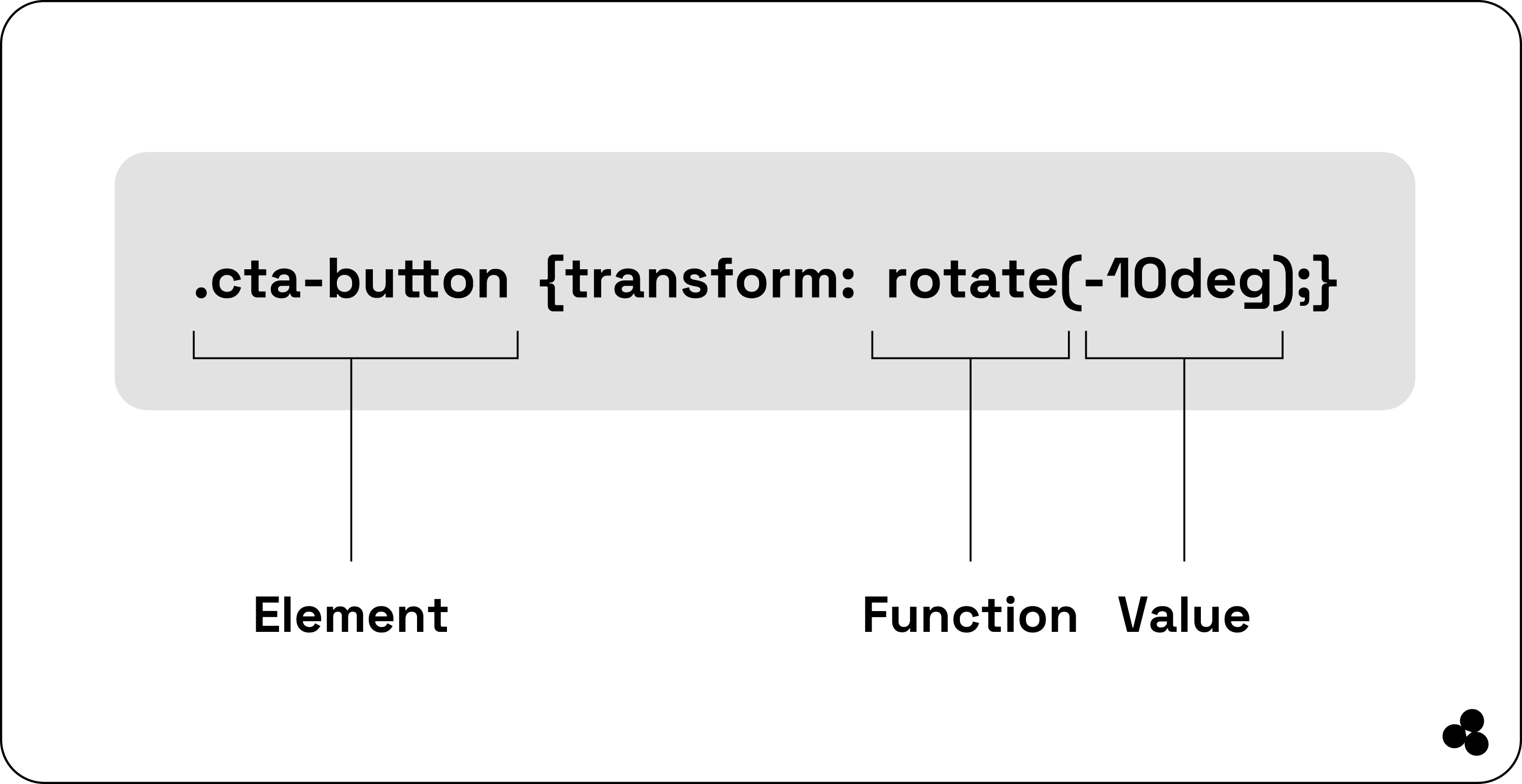
In this image, the “.element” is the name for the element you want to transform, while the value “.funtion” discloses the exact transformation and how much it must change.
The transform effects support numerous functions that you can combine to create intricate 2D or 3D transformations, which we will examine now.
2 Dimensional CSS Transformations
CSS transformations are incredible because they allow you to manipulate how you want your elements displayed on your site. Think of stuff moving around, but you use code. But what 2D CSS transformations do you get?
Rotating Elements
A common CSS transformation property is rotating things. If your website has a call-to-action button named CLICK ME, you can utilize the rotate function to make it look more interesting. Here is how you can employ it to make your element stand out, as seen in the image:
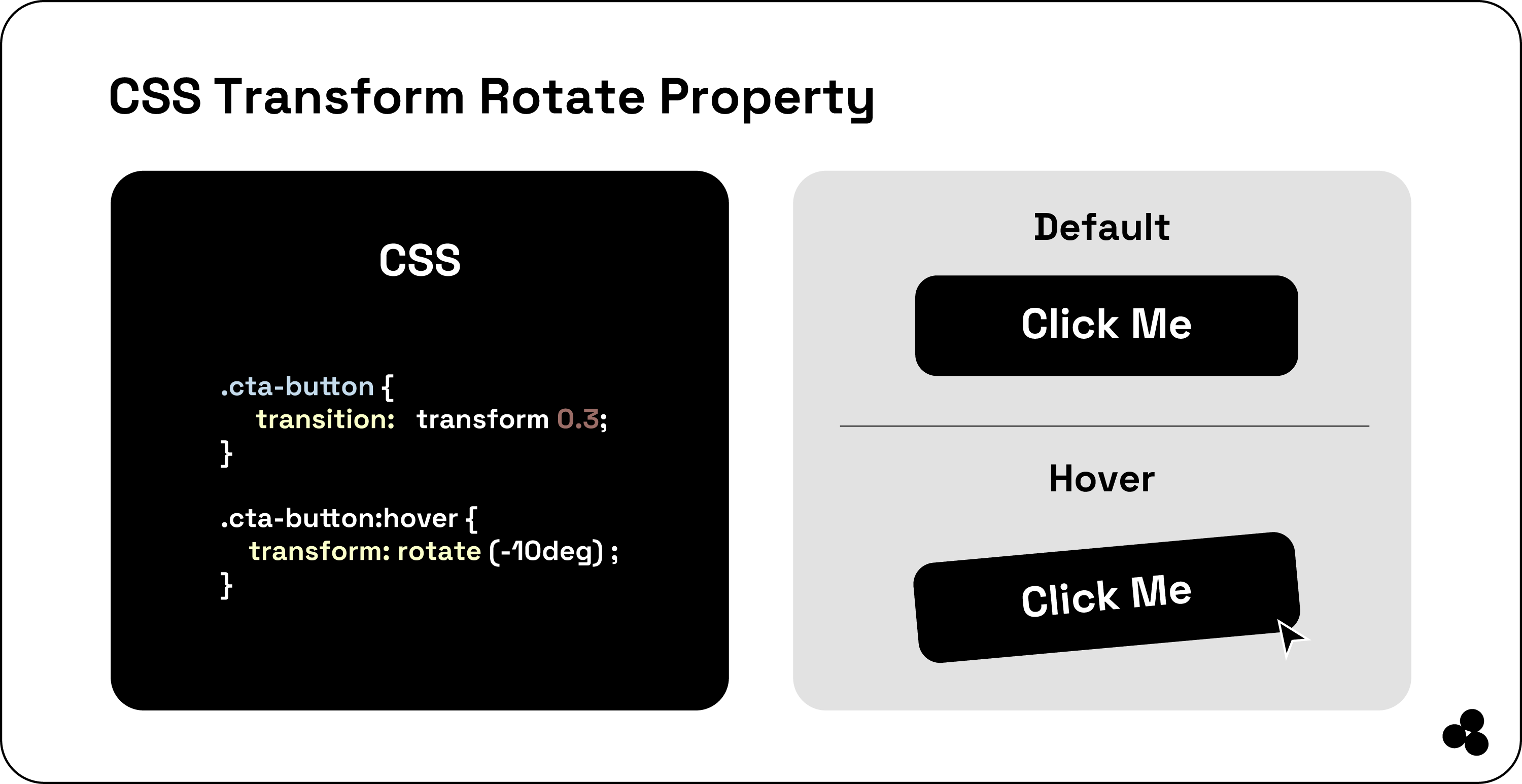
You specify that when a visitor hovers over the button with their mouse, it will revolve by—10°. The transition will take 0.3 seconds, leaving the user with a smooth transition.
Scaling Elements
You can use the “scale ()” function in your designs to create more depth with emphasis. For example, if you receive testimonials and want to showcase them to your visitors, you can use CSS transform to make them stand out when hovered over.
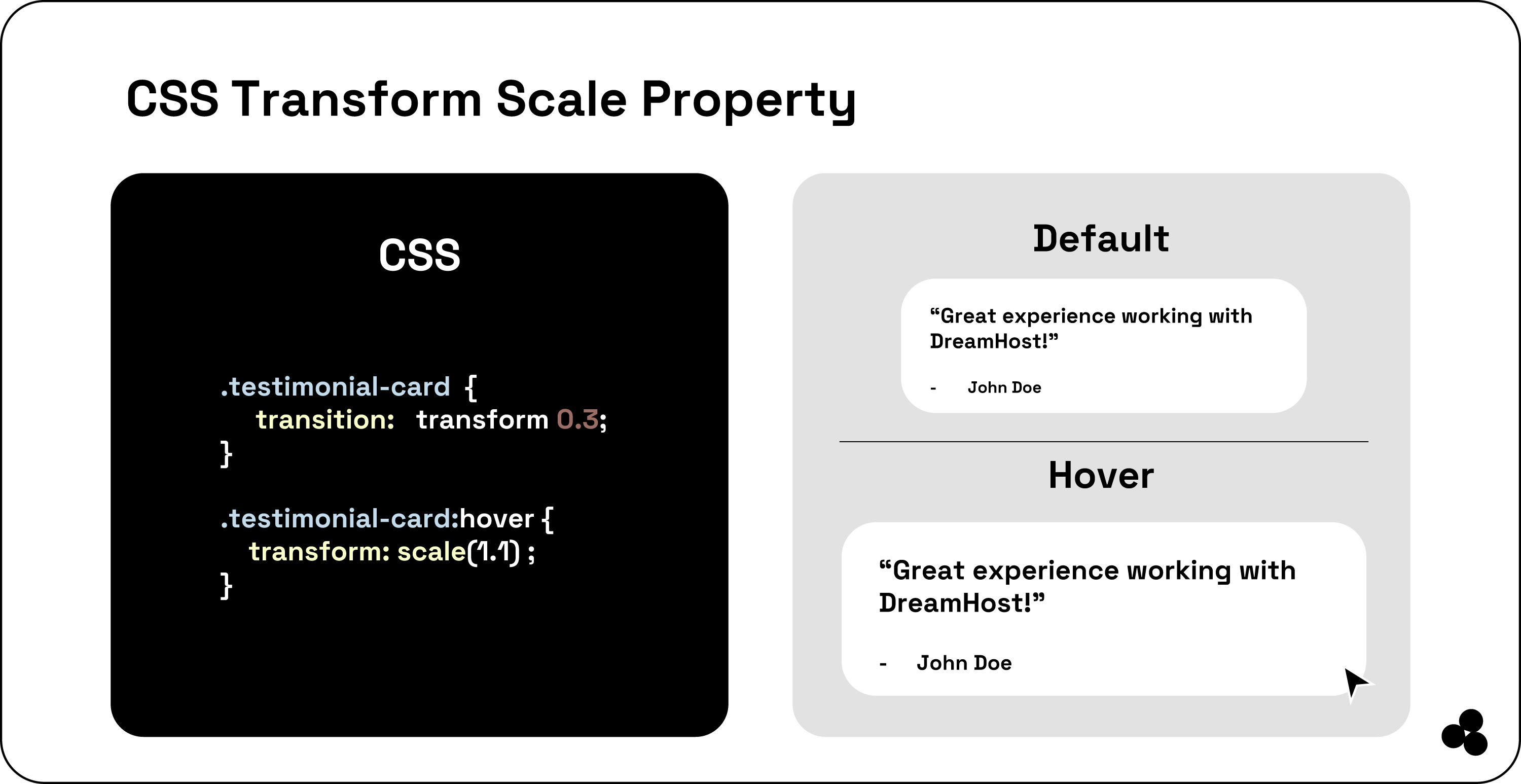
So, what happened here? First, you targeted each testimonial receptacle and assumed it was a testimonial card.
The transitions will smooth out your scaling impact over 0.3s to make it feel natural. When your visitor hovers over it with their mouse, it will scale about 1.05 times the actual size.
This small change grabs your visitor's attention to make your card stand out.
Skewing Elements
We found that using the skewing element as a transformation is fantastic. To create dynamic movement, you can tilt your elements along the “X” or “Y” axis. Here, we can look at your customer testimonials again as an example.
When a visitor hovers over it with their mouse, it will tilt along your X-axis by 10°, which is achieved with the skewX() CSS function to add visual interest.
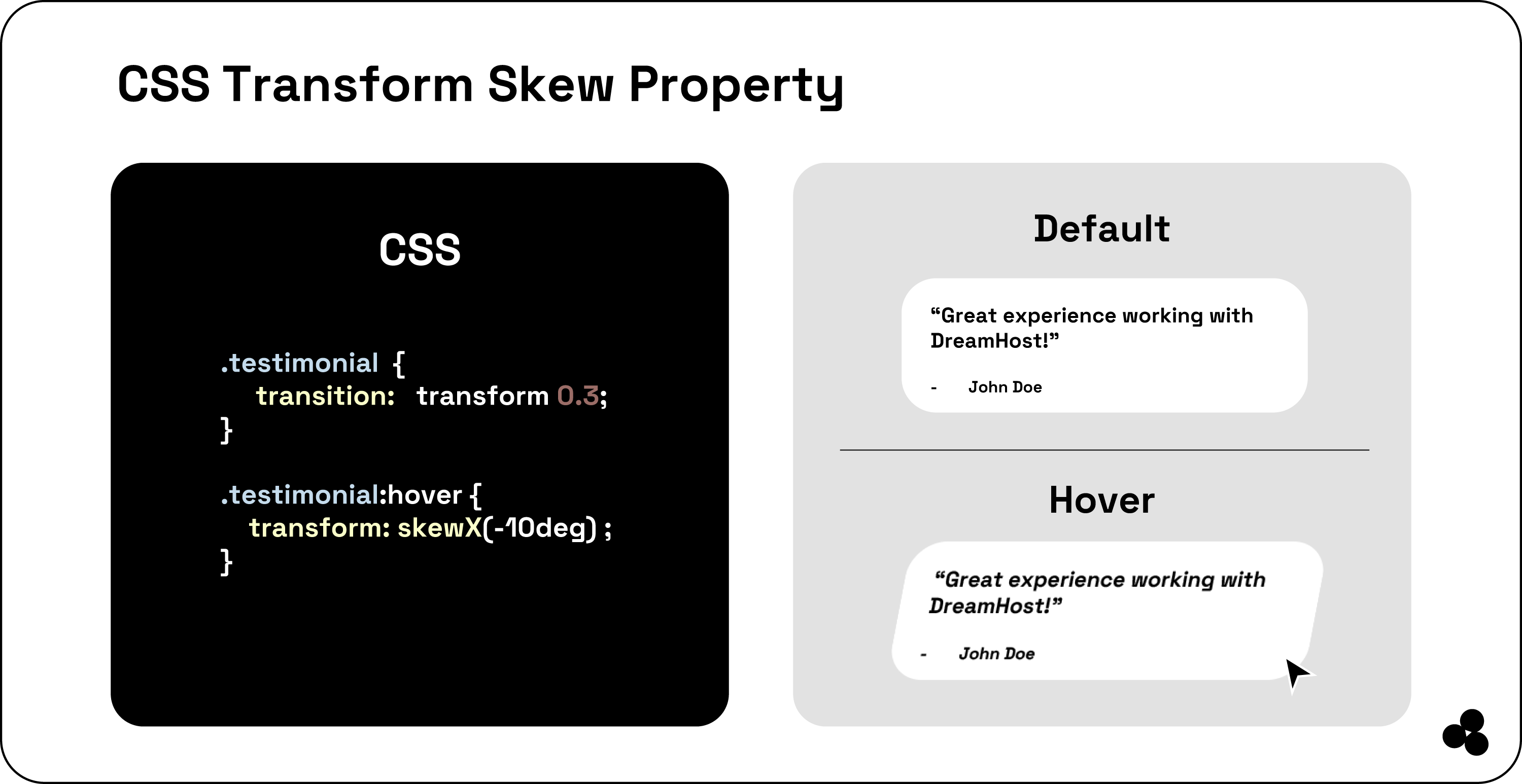
We use the transition property to specify the time it takes for your animation to finish, which is 0.3 seconds.
Moving or Translating Elements
When you look at CSS translation in your web design, it moves around the elements on a page. So, you are positioning your elements on a grid to move them along their X, Y, and Z-axis. You do this without altering or even moving anything.
A good example we love to use is your navigation bar, and you want it to react when your user’s cursor moves over your menu items. You do this using the translate () function. Here is the code to comprehend this movement better:
You will notice we applied a simple effect: When you move your cursor over your .menu-item, it moves 10 pixels to your right.
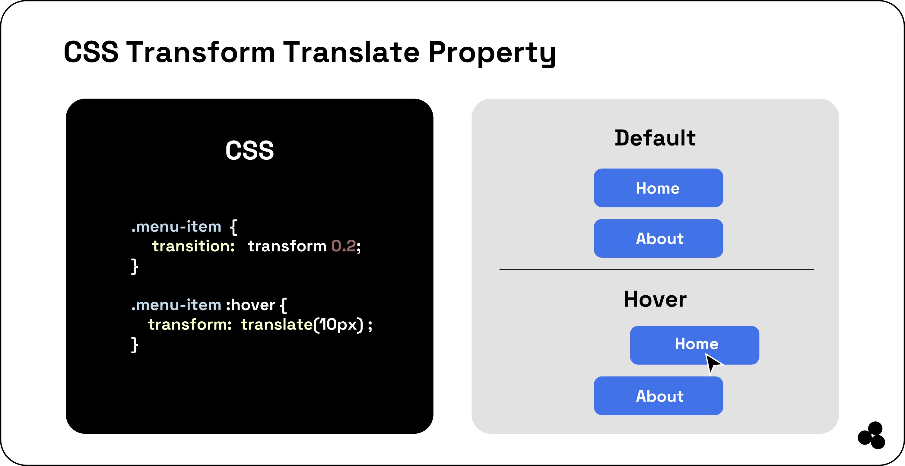
The fantastic thing is that CSS transform does not limit you to using them only with hover effects. Alternatively, you can design fantastic entry and exit animations to move an item relevant to a designated page when on it and more.
3D CSS Transformation
Now that you know how to move your elements up, left, down, and right, it relates primarily to two-dimensional movement. But you can take it further into your 3D world to manipulate your elements along their z-axis.
Here is what 3D transformation offers: First, you get the rotation angle “rotateX,” angle “rotateY,” and angle “rotateZ” functions. The “rotateZ” is your spinning wheel. In contrast, “rotateY” is your turning point, with “roateX” being the coin flip.
Each of the CSS transformations manages the rotation along a specific axis. Additionally, the “translateZ(z)” function enables movement of the element on the z-axis; using a positive value pulls it closer, while a negative value sends it further away.
Finally, the “scaleZ (z)” function provides a way to adjust the size of your element along the z-axis. You can visualize it as either compressing or elongating your element linearly.
When the value is greater than one, the element appears closer to the viewer, while values between zero and one will reduce its size, pushing it further back in the scene.
To complete the 3D transformation, you must set a viewpoint on your parent element. That perspective property will determine the length between the z=0 plane and your viewer.
Here are a few styles, including width, background color, and height, to help make your transition more transparent on your screen.
Here’s what your HTML would look like:
<body>
<div class="parent">
<div class="child"></div>
</div>
</body>
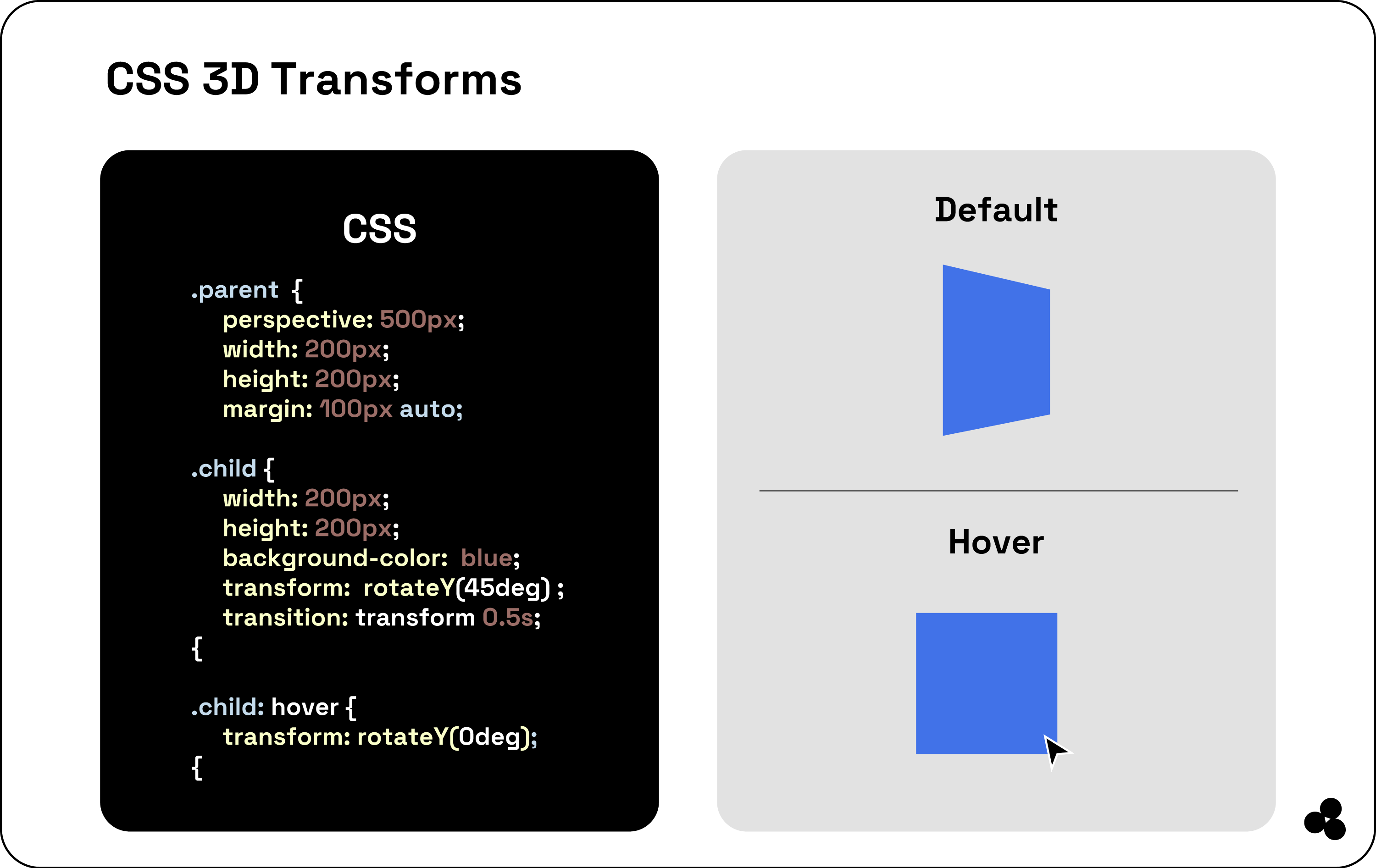
As you can see, we have two divs, a parent and a child. The parent sets the stage with a perspective of 500 pixels while the child is a red square rotated at 45° along the y-axis using “rotateY (45deg).
To reset the Hoover's rotation, use the command “transform: rotateY(0deg)” to smoothly transition back to its original position.
How to Regulate The CSS Transform Origin?
It is important to note that CSS transformations are centered around the middle of an element by default.
However, you can modify the origin point of these transformations using the `transform-origin` property in CSS.
This property allows you to define the X, Y, or Z coordinates for the pivot point around which the transformation occurs. Below is the syntax for using this property:
.element {
transform-origin: x-axis y-axis z-axis;
}
Now, you can specify the x- and y-axis values using the length units, such as pixels, keywords (center, top, right, bottom), and percentages. Still, this value is only applicable when doing 3D transformations.
Here is an example:
.box {
transform: rotate(45deg);
transform-origin: top left;
}
In the above example, your element rotates 45° around the top-left corner, not the center.

The “transform-origin” property provides precise control over the application of transformations, allowing us to craft more intricate and visually engaging designs.
Combining CSS Transform Elements
Another fantastic thing about CSS transform properties is that you can combine them to design stunning effects.
Chain your transformation functions to express your creativeness and capture your viewers with captivating designs.
A great example is using a product card on the website. When your visitor hovers over it, you can use a shadow effect to scale it up, rotate it, and lift it off the page.
.product-card {
transition: transform 0.3s, box-shadow 0.3s;
}
.product-card:hover {
transform: scale(1.05) rotate(5deg);
box-shadow: 0 10px 20px rgba(0, 0, 0, 0.2);
}
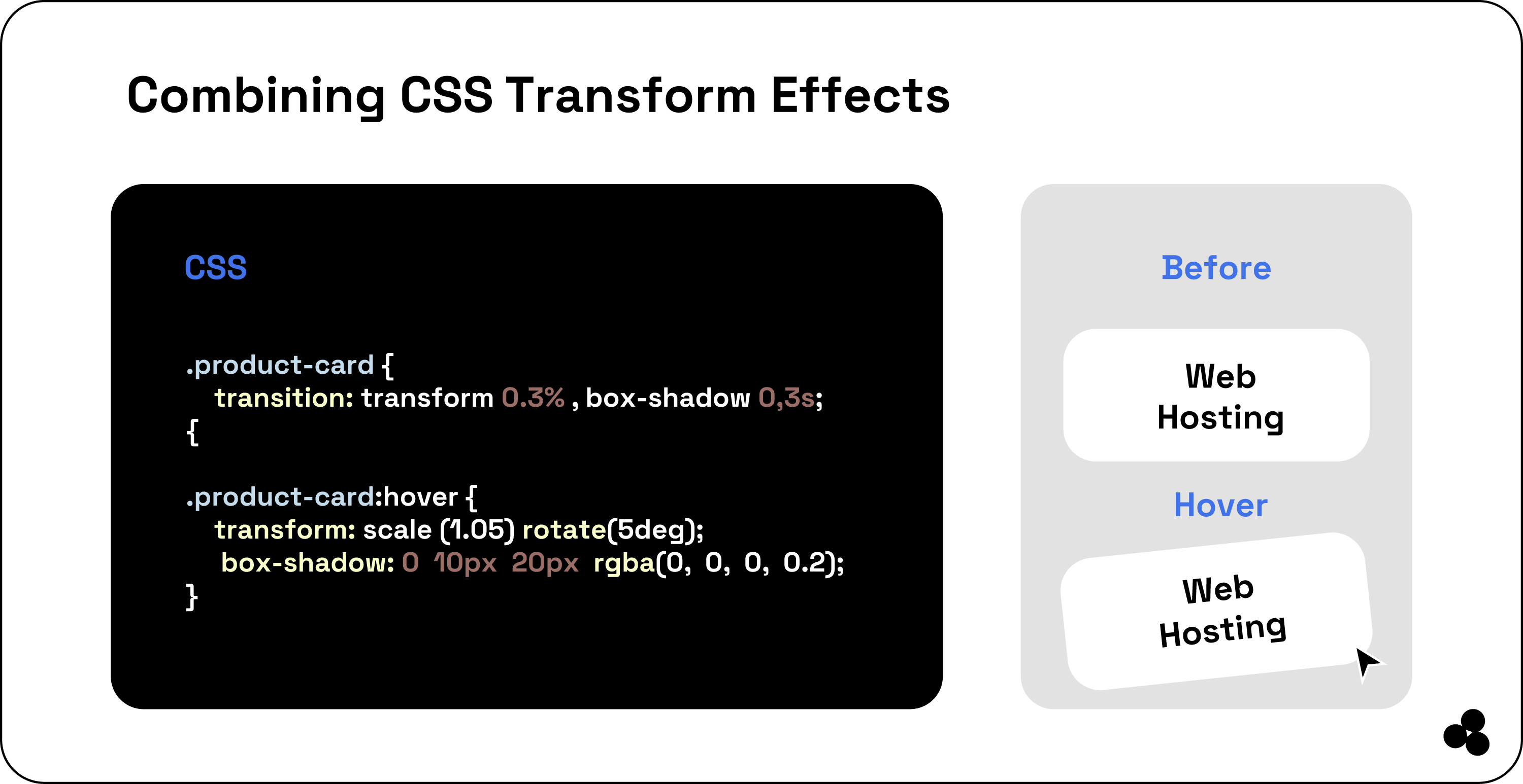
When someone hovers over your product card, it enlarges to 105% of its original size, rotates by 5 degrees, and gains a box shadow that creates a lifted appearance.
Wrap-Up: Continue Learning About CSS Transform
Here, you have learned the basics of CSS transformation, from positioning, rotating, and skewing to resizing, to create visually appealing elements for your visitors.
Building your website and working on various screens to make it more appealing to your visitors is a valuable skill. However, there is much more you can do with it, such as creating animations and smooth transitions.
You can learn how to animate your SVG images and find creative ways to help transform your other CSS properties. Still, the best way to get better is always to explore and try new things. One of those new things you can try is our microapp.
With it, you get customization at your fingertips without the need to write extensive code as it does for you. Get started today. You will not be disappointed.