REM vs PX in CSS: What's The Difference For Your Website?
REM and PX in CSS are both great for web development, but it helps to understand the differences. Learn the difference here to decide what works best for you.

Regarding the debate about REM vs. PX in CSS and HTML, both are used in web development. However, understanding their differences helps when creating quality websites.
You can use them to define your margin, image, and font size. Nonetheless, one thing is essential regarding web accessibility: pixels are less responsive than REM.
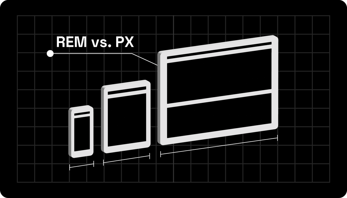
REM vs. PX: Differences
Pixels
Pixels are a CSS unit of measurement used in web development. They allow you to precisely define an element's size on a screen, making them popular for web developers who want complete control over their elements' sizes.
Pixel Uses
When pixels help define the size of an element on a website, you can feel assured that the component will be the exact size displayed on all screens.
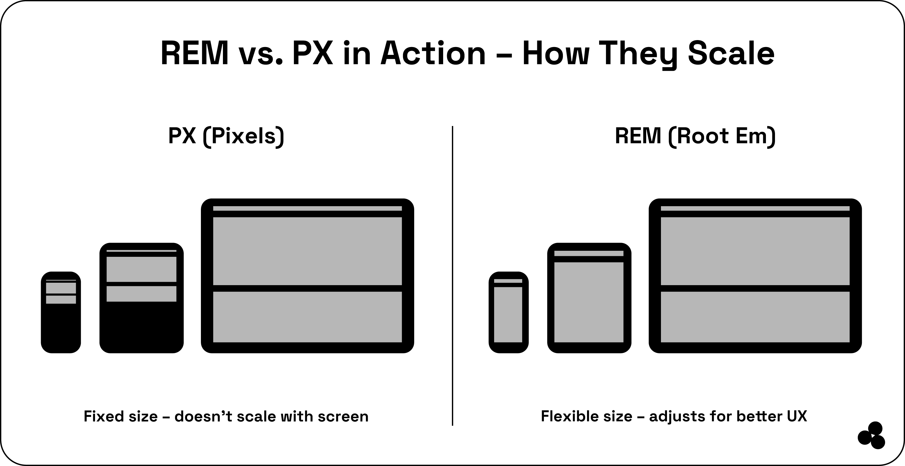
Still, this can become problematic if you want a website responsive to various screen sizes. Pixes have a fixed display and do not automatically adapt to any screen size.
Pixel Advantages:
- Provides size accuracy of the elements on a website
- You have complete control over the element size
Still, despite these advantages, pixels cause problems when you want your website to display effectively on various screen sizes. For this reason, you must weigh the advantages and disadvantages of using pixes in your website design.
Root Em (REM)
The REM is a comparable unit of measurement based on the parent font size, which defines the element size on a site. REM is more flexible than pixels, automatically adapting to various screen sizes.
REM Uses
Using REM to define our element size, our site displays the same size on all screens. Thus, your website displays correctly on various screen sizes to provide the best user experience.
REM Advantage
- You get flexibility as REM adapts to various screen sizes
- It provides the best user experience no matter the type of screen you use
With REM, you can better control your website display from PC to smartphone, providing an optimal user experience when viewing images.
Still, an essential note is that REM is more difficult to use if you are a beginner developer, as you must understand the patent font and how you use it to define the element size on the site.
REM vs PX: Which One Should You Choose?
When you compare REM and Pixels, you will see they are two different measurement units you can use to define your website's element size.
Pixels allow you to be precise in your element size, but when used on various screen sizes, they can sometimes cause problems with your website's display.
Then, your REM offers you more flexibility as it automatically adapts to different screen sizes to provide an optimal user experience. Understanding the difference between REM and Pixels can help determine what will work best for your website.
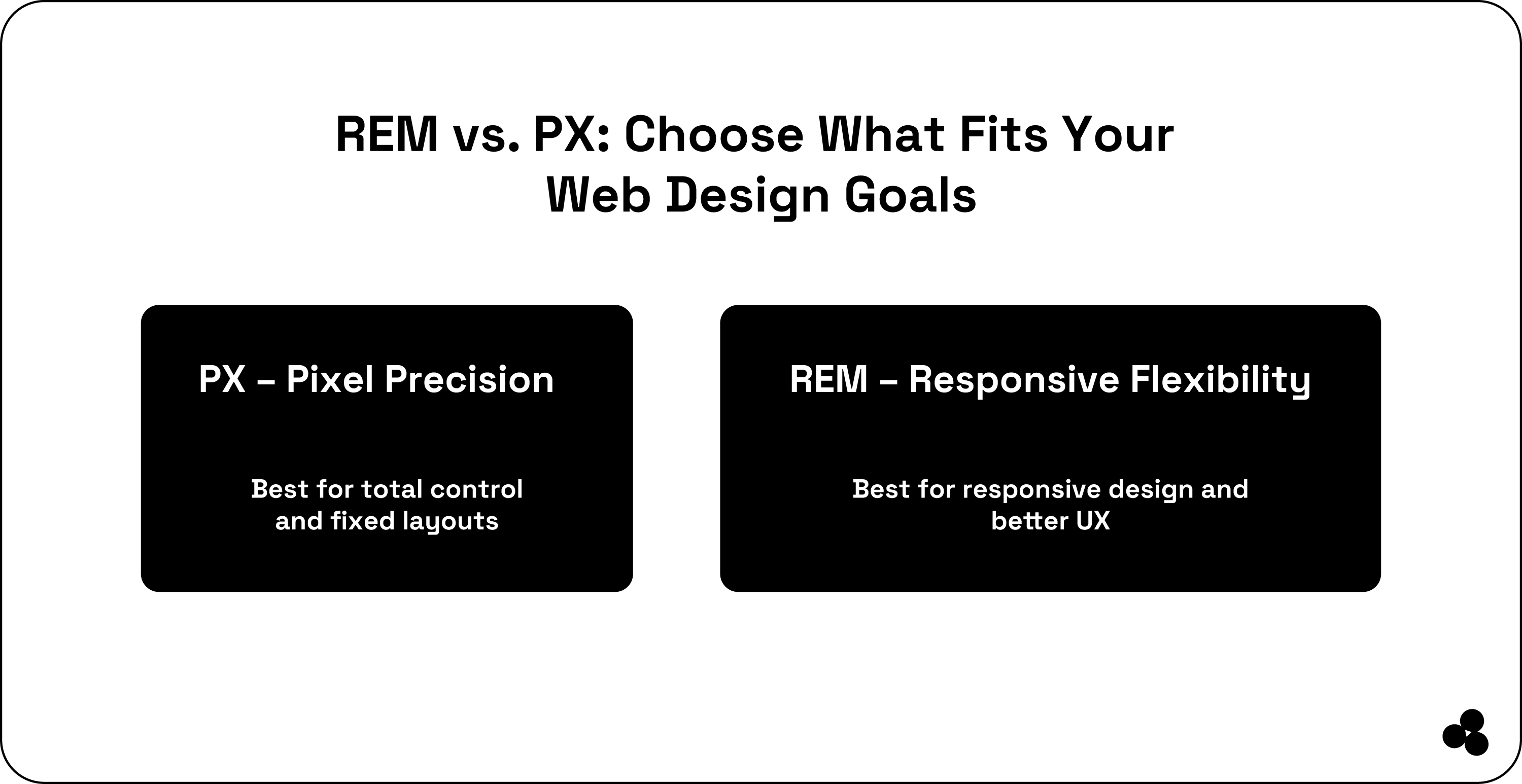
Pixels are the right choice for total control over element size, but if you want your website to display correctly on screens of various sizes, we prefer using REM.
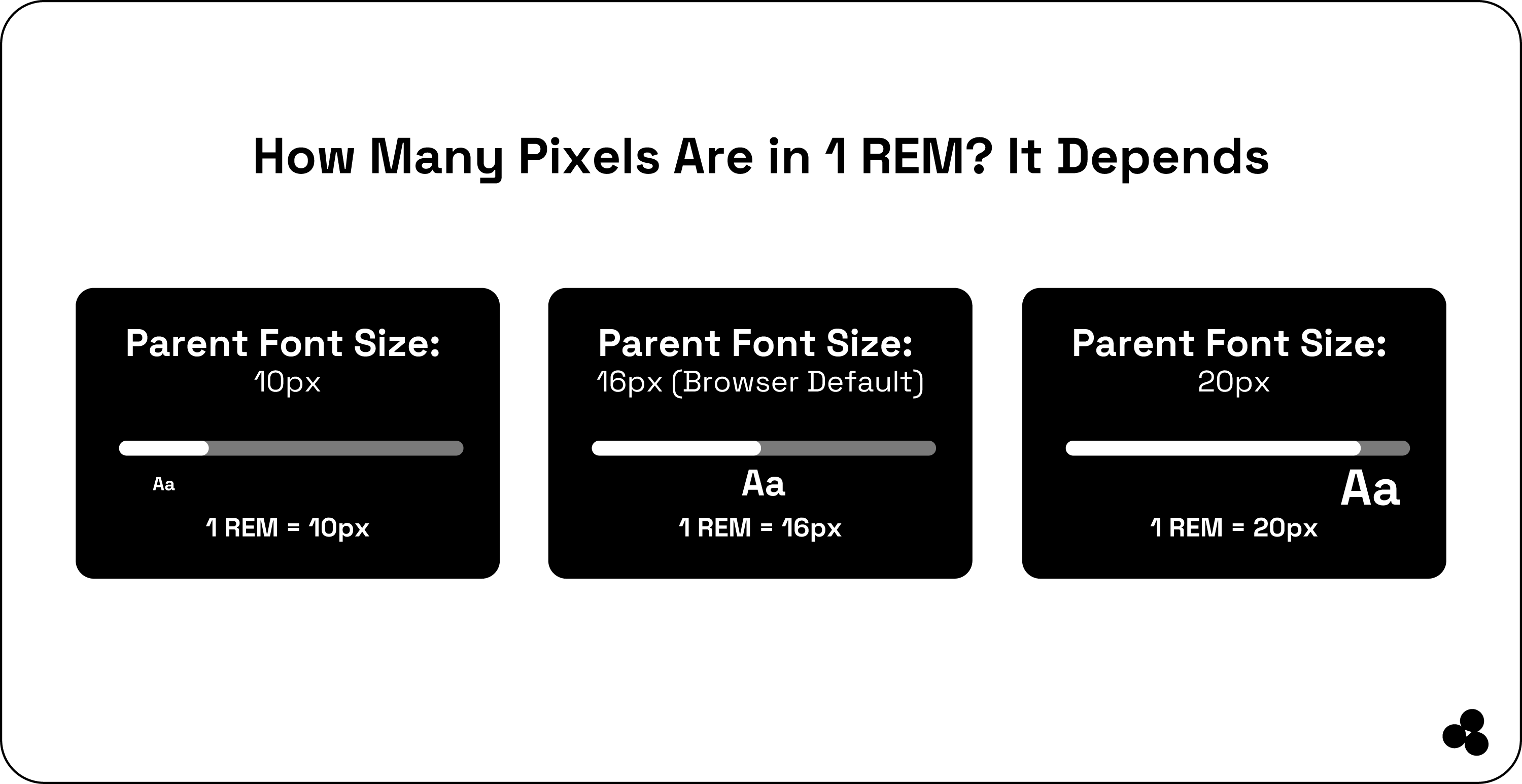
How Many REMs Are There in One Pixel?
Answering this question depends on the size of your website's parent font set and the browser used. By default, the parent font size is 16 pixels.
So, if you have a 1 REM element, it will be 16-pixel in size. Yet, you can set your parent font to other values, and it will impact your number of REMs in one pixel.
Converting REM to Pixel Example
For example, if you have a 10-pixel parent font size and set it to one REM, your element will have a 10-pixel size. However, if your parent font size is 20 pixels and you have an element with one REM, your element will have a 20-pixel size.
The number of REMs in one pixel will depend on the size of the parent fonts defined on your web browser, which will depend on your browser and site setup configuration.
Our Microapp Takes Care of Conversion Automatically
If you have a REM element, you can still convert it to pixels using our REM-to-pixel converter tool. The microapp is simple to use, as it automatically provides you with CSS code you can copy to add to your CSS stylesheet or code editor.
Wrap-Up: REM and PX in CSS
The micro-app benefits your web design workflow no matter what form you use between REM and PX.
You can save time by preventing manual calculations from being done, as everything is done automatically.
You can ensure accuracy and consistency in your design, allowing you to adjust your font size.
While we recommend using REM because it is more responsive, there is nothing wrong with using pixels, as they provide complete control over your element's size.